VetroPay App Redesign
-
Client
Ancla Technologies Ltd
-
Category
User Experience
-
Tools
Figma, Adobe Photoshop, Illustrator
-
Duration
6 months
About the company
Ancla Technologies is a digital solutions company that provides innovative technology-driven services, specializing in software development, cloud computing, cybersecurity, and IT consulting. Ancla focus is on creating bespoke solutions that address business challenges across various sectors, from finance to healthcare, also aiming to drive efficiency, growth, and digital transformation for clients, ensuring they stay competitive in the digital age.
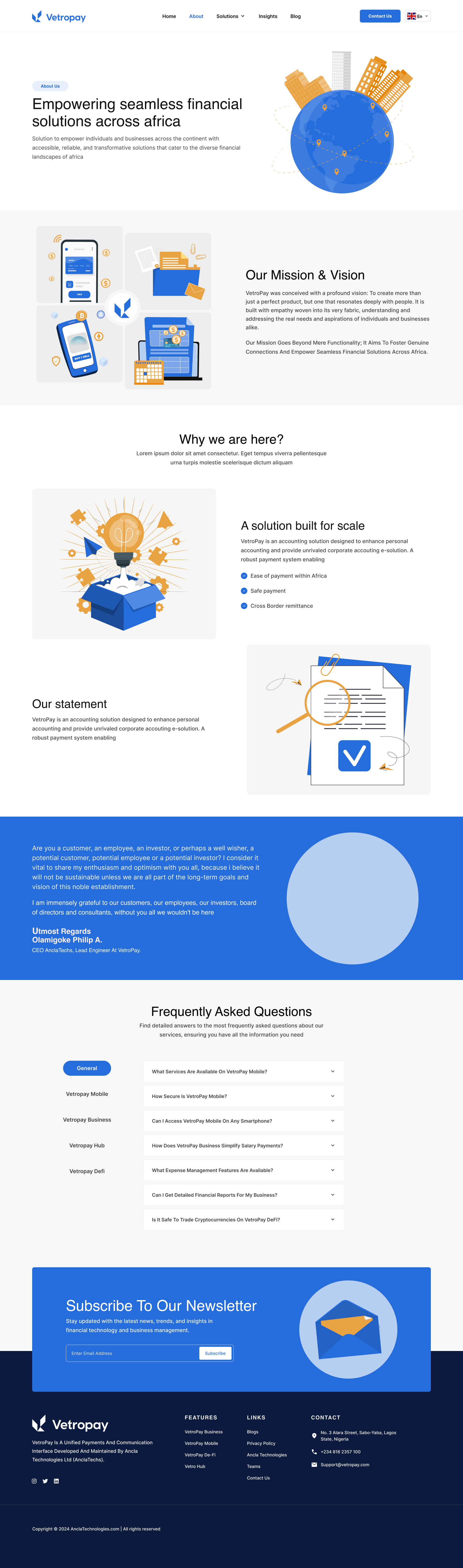
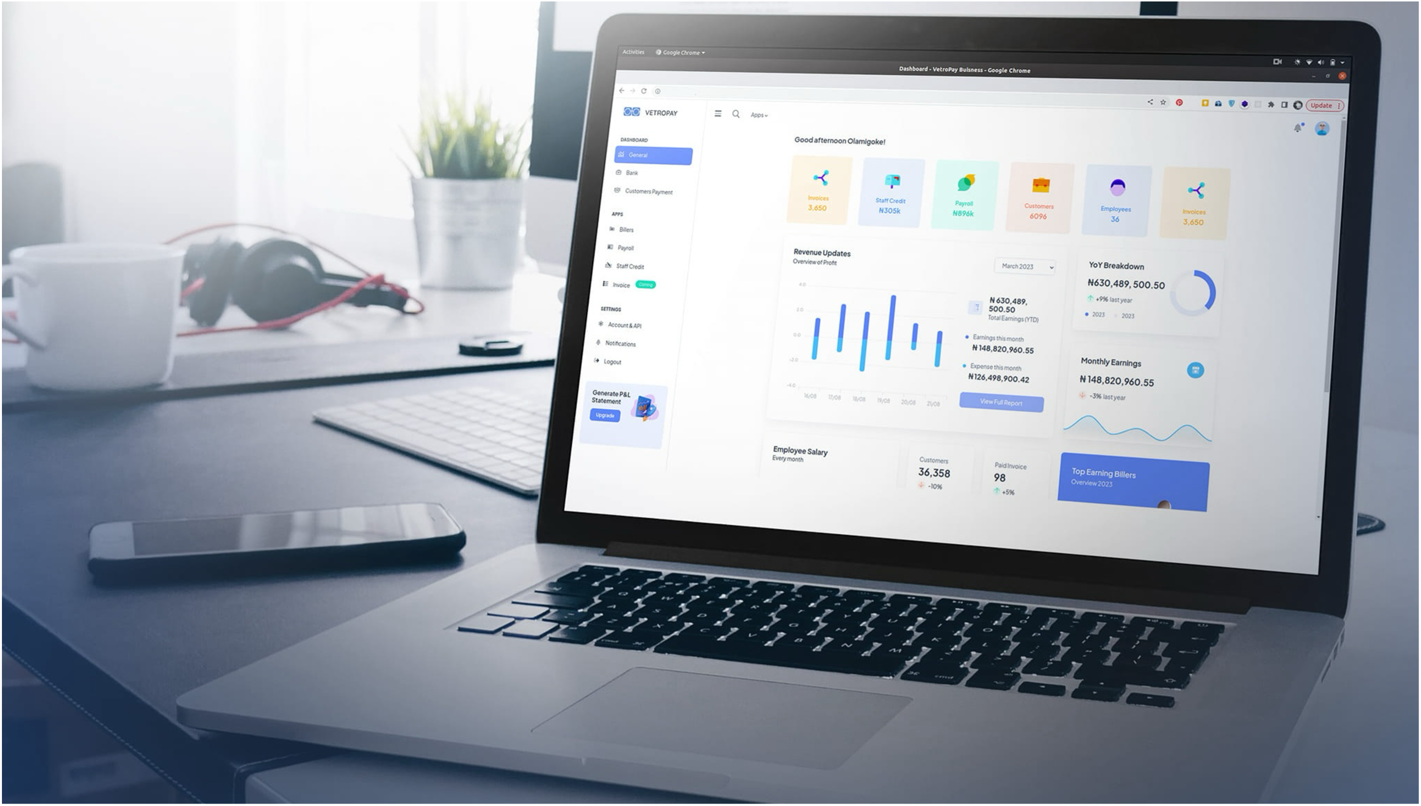
Overview
In this project, my design team and I were tasked with redesigning the user interface for a financial management product, both web and mobile. The primary goal was to enhance user engagement by streamlining the navigation and improving the overall visual appeal. Through a user-centered design approach, I focused on simplifying the complex workflows and creating an intuitive experience that caters to the needs of the users.
The user experience of banking apps is crucial in a time when financial activities are becoming more and more digital. Let's introduce VetroPay, a seamless payment platform suitable to be used anywhere around the World. This project is a creative redesign that aims to completely transform the user experience of the already-existing financial software. I aimed to revolutionise banking by applying state-of-the-art technology and an unwavering focus on user-centric design principles.
Given the challenge of reinventing a well-known platform, I set off on a 6 month journey that would change them all. Based on the app's current features and the changing financial technology market, I alongside my team painstakingly created a design that strikes a balance between novelty and comfort.
Team Objective
We aimed to achieve a 25% improvement in user retention by enhancing ease of navigation, a 50% reduction in time to complete primary tasks, and elevated user satisfaction scores with a fresh, modernized visual design.Problem Statement
The existing application faced significant challenges:• Complex Navigation: Users found it difficult to navigate through the app due to the cluttered interface and lack of clear pathways.
• Low User Engagement: The app struggled to retain users, leading to high drop-off rates after initial use.
• Outdated Design: The visual design was outdated and did not align with modern UI/UX standards, making it less competitive in the market.
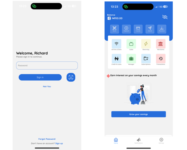
Old App Interface:
Design Process
USER RESEARCH
• Interviews & Surveys: Conducted interviews with existing users and distributed surveys to gather insights on pain points and desired features.
• Persona Development: Created user personas to guide the design process and ensure that the solutions catered to the target audience.
WIREFRAMING & PROTOTYPING
• Low-Fidelity Wireframes: Developed initial wireframes to outline the structure and layout of the new interface.
• Feedback Loops: Iterated on the wireframes based on user feedback and stakeholder input.
• High-Fidelity Prototypes: Created detailed prototypes using [design tools, e.g., Figma, Sketch], incorporating branding elements and interactions.
USABILITY TESTING
• Testing Sessions: Conducted multiple usability testing sessions with a diverse group of users to validate the design.
• Iterative Improvements: Made several adjustments to the prototype based on the testing results, focusing on improving accessibility and user satisfaction.
User Research
1. INTERVIEWS & SURVEYS
To gather qualitative insights, I conducted one-on-one interviews with 10 existing users of the app. These users were selected based on their varying levels of engagement with the app (frequent, occasional, and lapsed users) to ensure a diverse range of feedback. Additionally, I distributed a survey to 100 users through the app’s mailing list, asking them about their experiences, frustrations, and desired features.
Key Findings from Interviews:
- Navigation Frustration: Many users expressed frustration with the app’s navigation, mentioning that it took too many steps to complete common tasks, such as viewing account summaries.
- Feature Overload: Several users felt overwhelmed by the number of features available, which made the app feel cluttered and difficult to use, especially for first-time users.
- Visual Appeal: Users consistently mentioned that the app’s design felt outdated and lacked the polish of more modern apps they used regularly.
Survey Results:
- Ease of Use: Only 30% of respondents rated the app as "easy to use," indicating a significant area for improvement.
- Preferred Features: 55% of users stated they primarily used the app for bill payments, suggesting that other features could be deprioritized or integrated more intuitively.
- Design Preferences: When asked about design preferences, 70% of users indicated a preference for a cleaner, more minimalistic design, with an emphasis on readability and ease of navigation.
2. PERSONA DEVELOPMENT
Based on the data gathered from the interviews and surveys, I developed three user personas to guide the design process. Each persona represents a key segment of the app’s user base:
PERSONA 1: Damilola, the Organized Professional
• Age: 28
• Occupation: Financial Analyst
• Goals: Damilola uses the app to track his daily expenses and manage his monthly budget efficiently. He values quick access to key information and prefers a no-nonsense, streamlined interface.
• Frustrations: Damilola finds the app’s current layout too cluttered and wishes there was a way to customize her dashboard to only show the features she uses most often.
PERSONA 2: Bolanle, the only child
• Age: 35
• Occupation: Marketing Manager
• Goals: Bolanle lives with her father and she’s the only child, and she relies on the app to manage and pay for the household bills e.g. DSTv, Ikeja electric, airtime bill among others. She needs an app that is easy to use on the go, with features that help him quickly log expenses and monitor savings goals.
• Frustrations: Bolanle finds the navigation confusing, especially when trying to switch between different bill payments. She also feels that some features are buried too deep in the menu.
PERSONA 3: Cassie, the Tech-Savvy Student
• Age: 25
• Occupation: University of Lagos Student
• Goals: Cassie uses the app to keep track of her student fees savings. She prefers an app that is visually appealing and offering insights into her savings habits through easy-to-understand graphs and charts.
• Frustrations: Cassie feels that the app’s design is outdated and not visually engaging. She also struggles with the app’s slow response times when switching between screens.
3. USER JOURNEY MAPPING
I also created user journey maps for each persona to identify key pain points and opportunities for improvement. These maps provided a visual representation of the user’s interactions with the app, highlighting moments of frustration and delight.
• Damilola’s Journey:
- Scenario: Damilola wants to quickly check his monthly spending summary.
- Pain Point: The current process requires navigating through multiple screens, making it time-consuming to find the summary.
- Opportunity: Simplify the navigation by adding a quick-access button on the home screen for spending summaries.
• Bolanle’s Journey:
- Scenario: Bolanle needs to switch between different accounts to make bill payments.
- Pain Point: The process of switching between bill payment apps accounts is cumbersome, requiring several apps to be downloaded and creation of different accounts.
- Opportunity: Implementation of different bill payment merchants into the app.
• Cassie’s Journey:
- Scenario: Cassie wants to view a graph of her spending over the past six months.
- Pain Point: There is no graph functionality available in the app.
- Opportunity: Having a graph in a prominent location and design it to be more interactive and visually appealing.
4. COMPETITIVE ANALYSIS
In addition to user research, I conducted a competitive analysis to benchmark the app against similar products in the market. This involved evaluating key competitors based on their usability, design, and feature set.
• Key Competitors:
1. OPay: Known for its clean design and intuitive user interface. Users praised its easy navigation.
2. Paga: Offers a comprehensive set of features and it excels in providing detailed financial insights through interactive charts.
3. GTB: They have a relatively new app design with a modern design and simplified feature set. Users appreciate its minimalistic approach but noted that it lacks some of the more advanced features offered by our app.
• Takeaways:
- Simplicity Wins: Apps with a cleaner, more focused design were preferred by users, even if they offered fewer features.
- Customization is Key: Users appreciated the ability to personalize their experience, such as by customizing dashboards or hiding unused features.
- Visual Appeal Matters: Apps with modern, visually appealing designs were more likely to retain users, even if their functionality was similar to less attractive alternatives.
CHALLENGES AND SOLUTIONS
• Challenge: Balancing simplicity with functionality.
• Solution: Introduced a modular design approach, where complex features were grouped into intuitive sections, making it easier for users to navigate without feeling overwhelmed.
• Challenge: Ensuring a consistent experience across different devices.
• Solution: Implemented a responsive design strategy, ensuring that the interface adapted smoothly to various screen sizes and devices, providing a consistent user experience.
Typography
I've selected the 'Roboto font family' as our primary typography choice.
Roboto's versatility, readability, and professional appearance make it an ideal fit for a financial technology banking app. It's modern yet timeless design ensures optimal readability across various screen sizes, instilling trust and reliability in users. By maintaining consistency throughout the interface and utilizing Roboto's extensive font weights and styles, I ensure a cohesive and intuitive user experience.
In summary, my typography selection is grounded in Roboto's superior qualities, aiming to enhance usability and set a new standard of excellence in financial technology design.
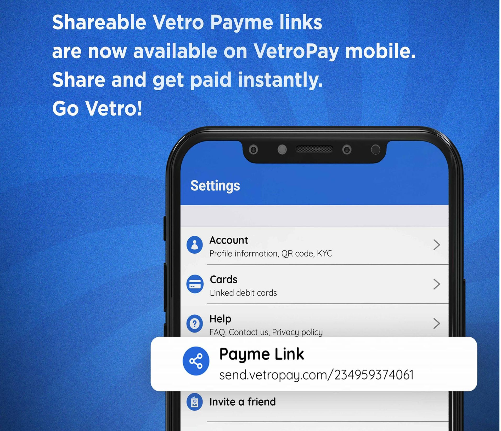
Final Outcome
The redesigned app was launched with the following key improvements:
• Improved Navigation: The new design features a simplified navigation structure, allowing users to find what they need quickly and efficiently.
• Enhanced Visual Appeal: The updated interface incorporates a modern, clean design with a cohesive color scheme and typography, aligning with current UI trends.
• Increased User Engagement: Post-launch analytics showed a 35% increase in user retention, with positive feedback highlighting the ease of use and aesthetic improvements.
Conclusion
The basic idea was to find a balance between the thin, wispy sans-serif used to indicate a ‘futuristic‘ tone, and a bold, masculine font synonymous with ‘construction‘. We came up with something in the middle, leaning towards lighter-weighted fonts, but still with a hint of that blocky ‘construction’ vibe. We use Chaney for general display and when we want to drive attention to the content, and the technical and geometric Sora font for the body copy and paste overall hierachy.
The basic idea was to find a balance between the thin, wispy sans-serif used to indicate a ‘futuristic‘ tone, and a bold, masculine font synonymous with ‘construction‘. We came up with something in the middle, leaning towards lighter-weighted fonts, but still with a hint of that blocky ‘construction’ vibe.